At the ATypI conference in Brisbane, Australia, last month, there were a number of talks and presentations that looked at ways to automate some of the tasks of type design and typesetting. In the era of rampant AI, this is hardly surprising. Two of them came on either side of the lunch break on the first day of programming.
First was a presentation by Arushi Jain and Ashish Jain, computer scientists from Adobe in India, with the clearly descriptive title “Enhanced Paragraph Justification with Consistent Spacing.” They were proposing a system for doing essentially what an individual typesetter would do to tweak the text to keep its spacing smooth and undisturbing. This is what Olav Martin Kvern calls “walking the lines.”
There is already a fair amount of this built into InDesign’s paragraph composer, which takes into account the effects on an entire paragraph when any change is made that affects the spacing of the text. (This is why, if you’re making changes to a paragraph in InDesign and you’ve got paragraph composition enabled, you may find the line breaks changing not only in the line you’re working on but in all the subsequent and previous lines in the paragraph.) What Arushi and Ashish proposed was to use artificial intelligence to take the process further.
One of the changes they suggested got a startled reaction from the audience. In addition to making spacing and hyphenation adjustments, their system could propose changes to the wording in order to make a more pleasing justified line. It was even smart enough that if it replaced a word in one line with a synonym, and that synonym showed up farther along in the paragraph, the system would change that one too, in order to avoid repetition. (In their example, it replaced the repeated word with the same word it had replaced in the earlier line, thus essentially swapping them.) In a document like a computer manual or a business report where the precise wording might not be that important, I could imagine making a suggestion like this; in serious prose like a novel or a literary essay, or even in a blog post like this, it would be intrusive at the very least. The important point is that decisions like this are not typographic but editorial: they affect the content, not just the appearance. A typesetter can suggest a change, but the author or the editor needs to approve it.


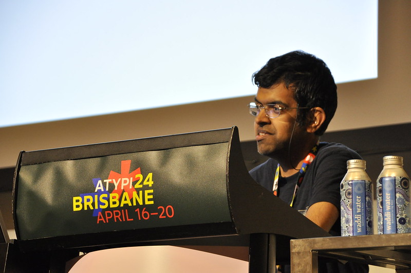
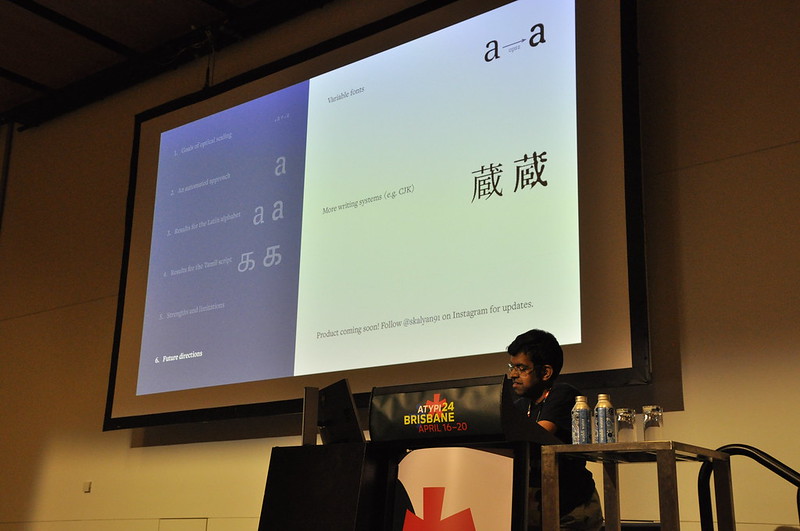
The second presentation was machine learning specialist Siva Kalyan’s talk on “Automating the Optical Scaling of Fonts.” What he has tried to do is use machine intelligence to automate the finicky process of creating optical sizes of a typeface, each one appropriate to its intended size. As Siva pointed out, the purpose of optical sizes is to make the typeface look the same and have the same visual texture at any size; without optical scaling, large type can look heavy and clunky, while small type can look light and weak. By adjusting parameters like the stroke weight of a typeface as it gets bigger or smaller, Siva’s software can generate consistent-looking type at any size. He demonstrated how this would work in practice by applying it to Noto Serif and showing the before-and-after. He also showed an optically scaled typeface for the Tamil script, thus making it clear that this is not an issue only in Western scripts.
Any automation can be done well or done badly. The ultimate judgment is not just whether it speeds things up but whether it makes the results better.
While talking with Siva after his talk, I suggested that his system could adjust still more parameters, to get a more refined result. The usual approach to designing a typeface for very small sizes, such as a caption version of a text face, is not only to make the strokes – especially thin strokes – a little heavier and more robust, but to subtly enlarge the counters, increase the x-height, and widen the characters a little. If his program made these adjustments as well, the results might be even more convincing and thus useful to both type designers and typographers.
I’m looking forward to seeing where Siva takes this in the future.
Any automation can be done well or done badly. The ultimate judgment is not just whether it speeds things up but whether it makes the results better. Both of the proposals that I saw in Brisbane are aimed at improving the quality of the reading experience.
Related Links: