Latest
Latest
The chance to revisit and expand on work completed for what was seemingly a one-time project for a client is uncommon.
Originally available in the 1970s as "Astra" for dry transfer type, this design was inspired by the American flag and graced magazine covers, posters, albums, and books for over a decade before falling into obscurity with the switch over to digital technology in the '80s.
What does “weight” mean in the design of a typeface?
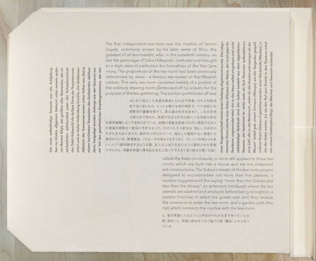
When you design a document that contains multiple languages, what are the first things you need to think about?
Presenting the friendly and modern sans-serif typeface Peasy™ designed by Peter Cho.
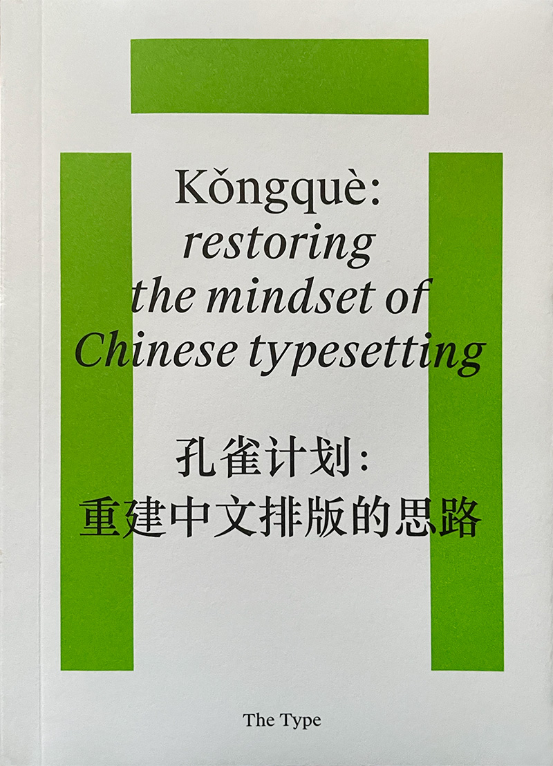
Chinese type, unlike the Latin alphabet, lends itself naturally to a grid system: each character, no matter how simple or complex, is defined within a notional square box.
🗡️ The dangerous and alluring Ritualist by Justin Penner is the latest typeface at Delve Fonts. 🫦

At the ATypI conference in Brisbane, Australia, last month, there were a number of talks and presentations that looked at ways to automate some of the tasks of type design and typesetting. In the era of rampant AI, this is hardly surprising.

Traditional graphic design in “ye olden days,” before computers revolutionized the design scene, was slow, labor-intensive, and, much of the time, a royal pain in the butt to do. However, I feel fortunate to have been a design student when I was because it taught me to love and embrace constraints.
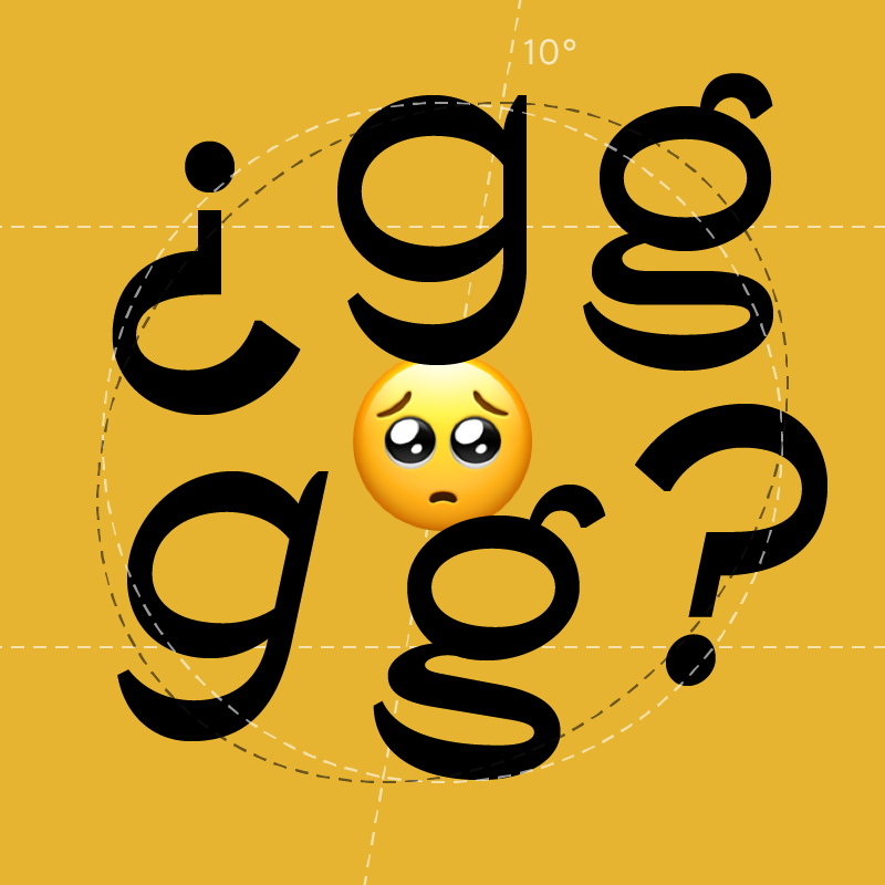
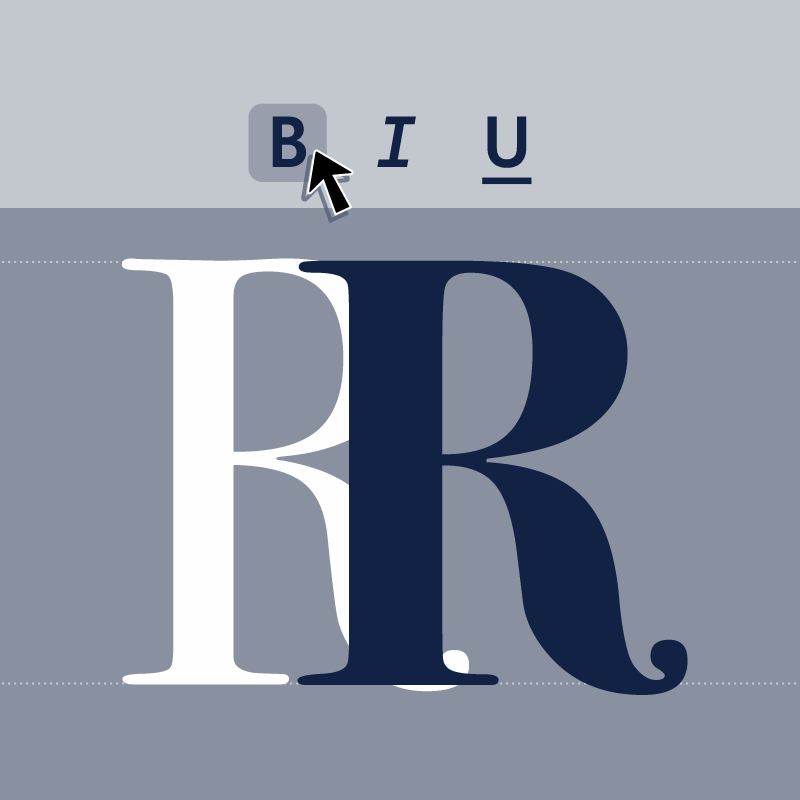
What happens when you italicize a font?
Type designers love to see how their fonts are used. Some are typographers themselves – visual designers who use type – and may even have created a typeface because they needed it for some specific project they were working on. But typography and type design are two different crafts, not necessarily practiced by the same people.
The focus of this new conference was on “disadvantaged languages” and their writing systems – languages that do not have adequate representation in the Unicode standard or that do not have effective ways of being used in the digital world.
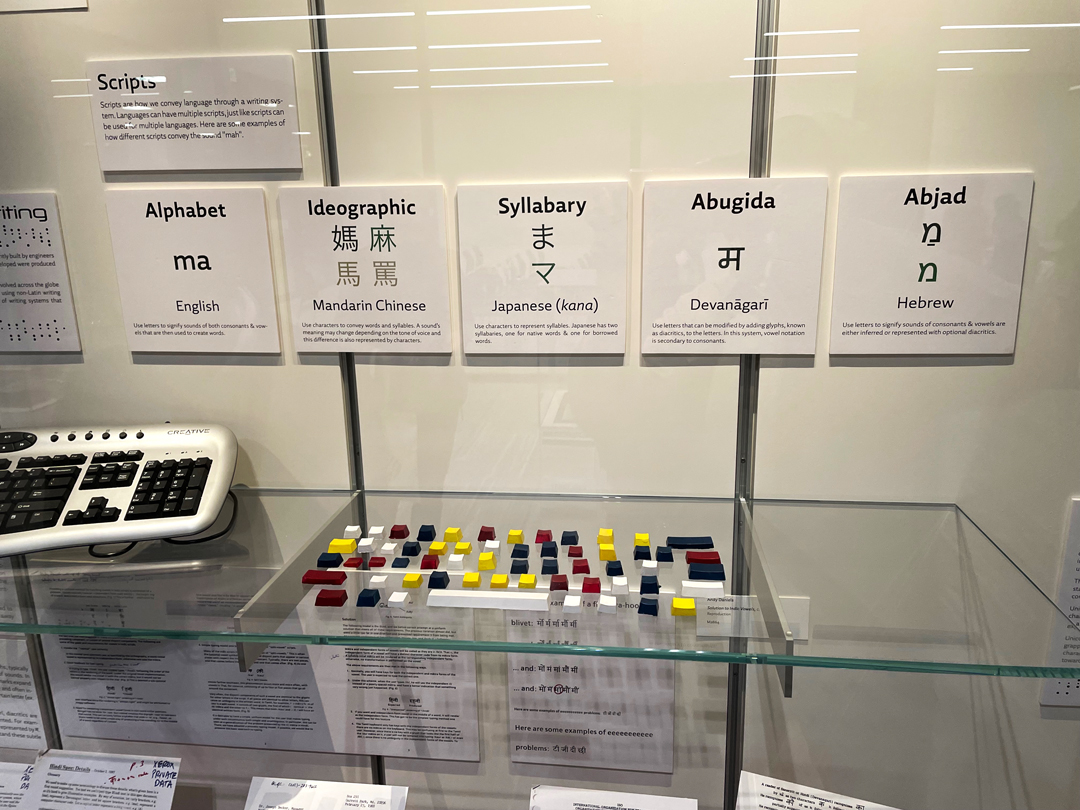
The October event, held in the Silicon Valley Archives at Stanford’s Green Library, was an intense hour-and-a-half round table of presentations and dialog among almost a dozen experts in different aspects of encoding language.
The May conference of ATypI (Association Typographique Internationale) in Paris was the first since Tokyo in 2019. In August, TypeCon met in Portland, Oregon, for its first live event since TypeCon “Nice” in Minneapolis, also in 2019.
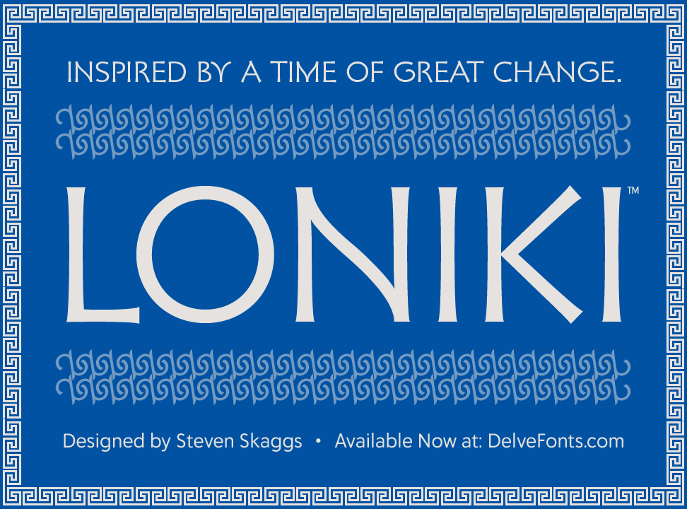
The basis for Loniki is an inscription from the 5th century with rational geometry and sinuous curves that embodies the blend of cultures prevalent in the region at the time.
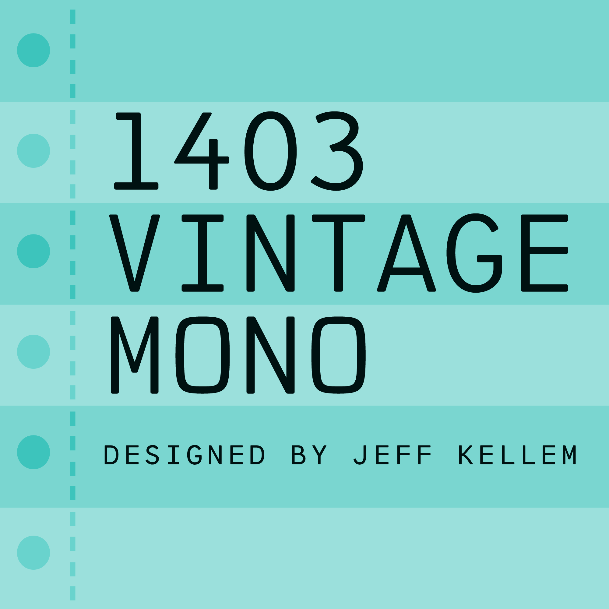
Originally available in the 1970s as dry transfer type, this unique design was inspired by the bright lights of Las Vegas and graced magazine covers, posters, albums, and books for over a decade before being sidelined in the switch to digital technology in the '80s.
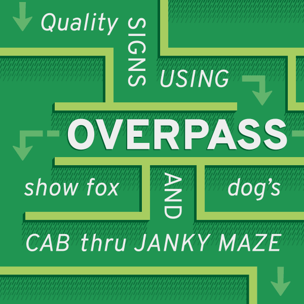
With this update, variable font technology is introduced and accessibility is greatly increased with support for over 300 languages, including the Cyrillic script, Vietnamese, Swahili, and many more. Overpass now tips the scales at 25 fonts total, including variable versions and the monospaced styles tailored for coding.
This action-packed typeface has received an exciting upgrade with many new glyphs drawn by Joachim Müller-Lancé and production support by Delve Withrington.

Inspired by the London foundry Stephenson Blake typeface Blackfriars, designer extraordinaire Roberto de Vicq de Cumptich reimagined this quirky gem for today.