When you design a document that contains multiple languages, what are the first things you need to think about?

Who is the document for, and what does it have to do? Does it contain the same text in two or more languages, or is it primarily in one language with some bits in another? Do the languages all use the same script? Do you have fonts that will support each of the languages?
Once you’ve narrowed down these basics, you can begin thinking about the actual design of the document. Is it a book? A magazine? A poster? A menu? A website? Will it be printed, viewed digitally, or a combination of both?
The goal is usually to treat both or all of the languages equally
The world is full of multilingual typography, whether it’s in advertisements along the access road to an international airport or in a book. Often enough, it’s meant to communicate the same information to different audiences who speak and read different languages. In that case, you’re dealing with parallel texts.
This is a very common occurrence in Europe, where many languages overlap, and in India, where not only languages but scripts overlap. The first few issues of the design magazine Eye were published in three languages: English, French, and German, with the text translated from whichever language it had been written in into the other two. The trilingual Swiss customs form designed in the 1960s by Jan Tschichold is a simple, elegant form that speakers of any of those languages would have no trouble understanding and filling out.
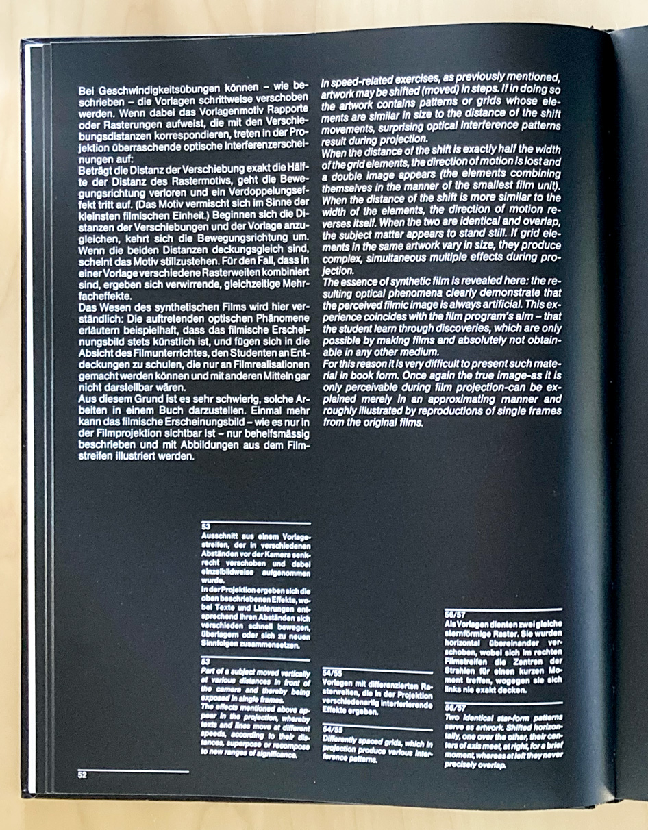
Both of these examples involve separate languages that all use the same script: the Latin alphabet. Some languages that are written in Latin script have a great many diacritical marks; some have almost none. And the length of a text may vary from language to language. The goal is usually to treat both or all of the languages equally, to give each language the same kind of treatment, even if one block of text might end up shorter or longer than another. Parallel columns, side by side on the page, are a common solution to this problem. I have also seen publications that used the position on succeeding pages as a clue to which language you’d be reading; this can be confusing if it’s not done well.
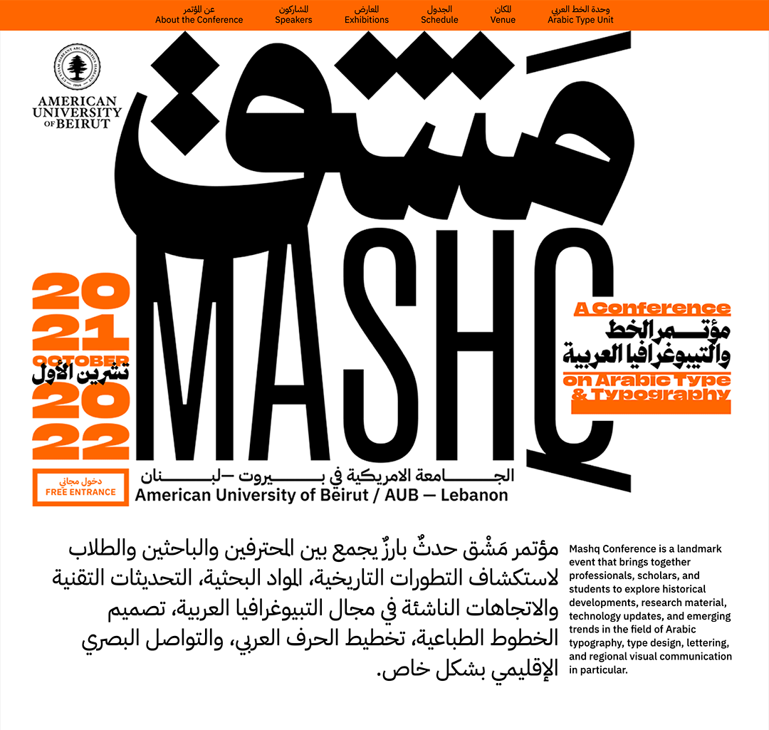
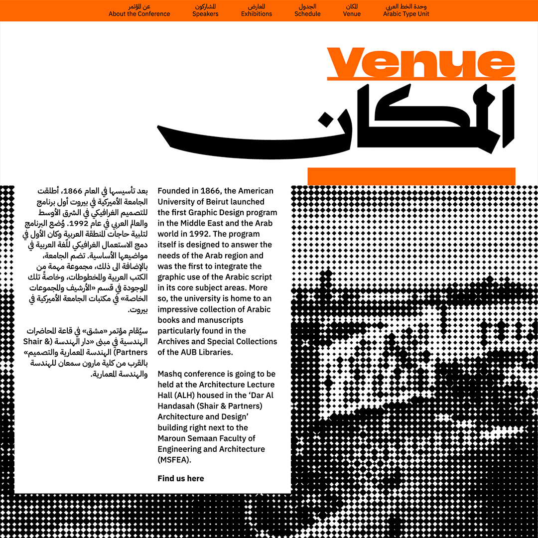
When the languages involve different scripts, the problem complicates itself. Giving each text the same treatment may not work. A passage in Arabic may look much smaller and lighter than the same passage in English. Do you adjust the size and/or weight of the Arabic to visually match the English? Or vice versa? What about a trilingual text in Hebrew, Arabic, and Amharic? What if one version of the text is in Japanese, another in English, a third in Armenian?
These days, some type designers have tried to create “global” typefaces, super- families that have all the glyphs for many different scripts in the same font file.
The idea of “harmonizing” type designs among different scripts may be popular with global advertisers, but it doesn’t necessarily do justice to the readers of each language. Using typefaces that weren’t designed together but that seem compatible and comfortable next to each other is one of the arts of multilingual typography. But sometimes looking similar isn’t the best solution; sometimes a very obvious contrast works better.
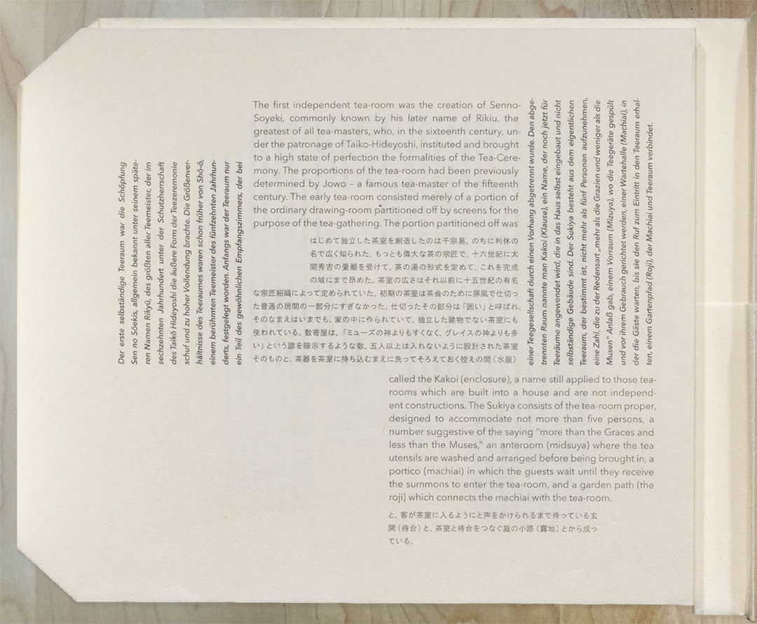
It’s important, whether in designing a global typeface or in designing a multiscript publication, to be aware of the typographic standards and cultural expectations of each script’s readers, and to respect them. That may mean not treating them the same, but achieving a similar effect in each language.
Fierce arguments go on among type designers about whether to adapt the forms and styles of one writing system to match another. Cyrillic and Greek letters are related to Latin, and you might think that they could all look similar, even including some letter shapes that seem common to two or all three of the languages. As type designer Gary Munch observed after designing Candara, one of Microsoft’s ClearType text fonts, in the early 2000s: “Greek is much more gestural than the other two [Latin and Cyrillic] in its lowercase, and so wants to swing along more loosely. There are so many round bowls that need to be restrained from being too dominant, and there’s a wide range of shapes that give Latin concepts such as baseline and x-height only passing nods.” One of the points of pride in the development of the ClearType fonts was that all three scripts were designed together, unlike situations where a Latin is designed then a Greek and Cyrillic are made to match it.
Henry Steiner, who has spent his career in Hong Kong designing multicultural logos, bank notes, posters, and identities, argues that parallel texts in Chinese and English do not have to occupy the same space on the page. Giving each script a column width and text block that feels appropriate to that language is a more even-handed treatment, even if at first glance it looks unequal. More recently some designers have taken this further, working with scripts that are written and read in different directions and giving them entirely different orientations and shapes on the page.
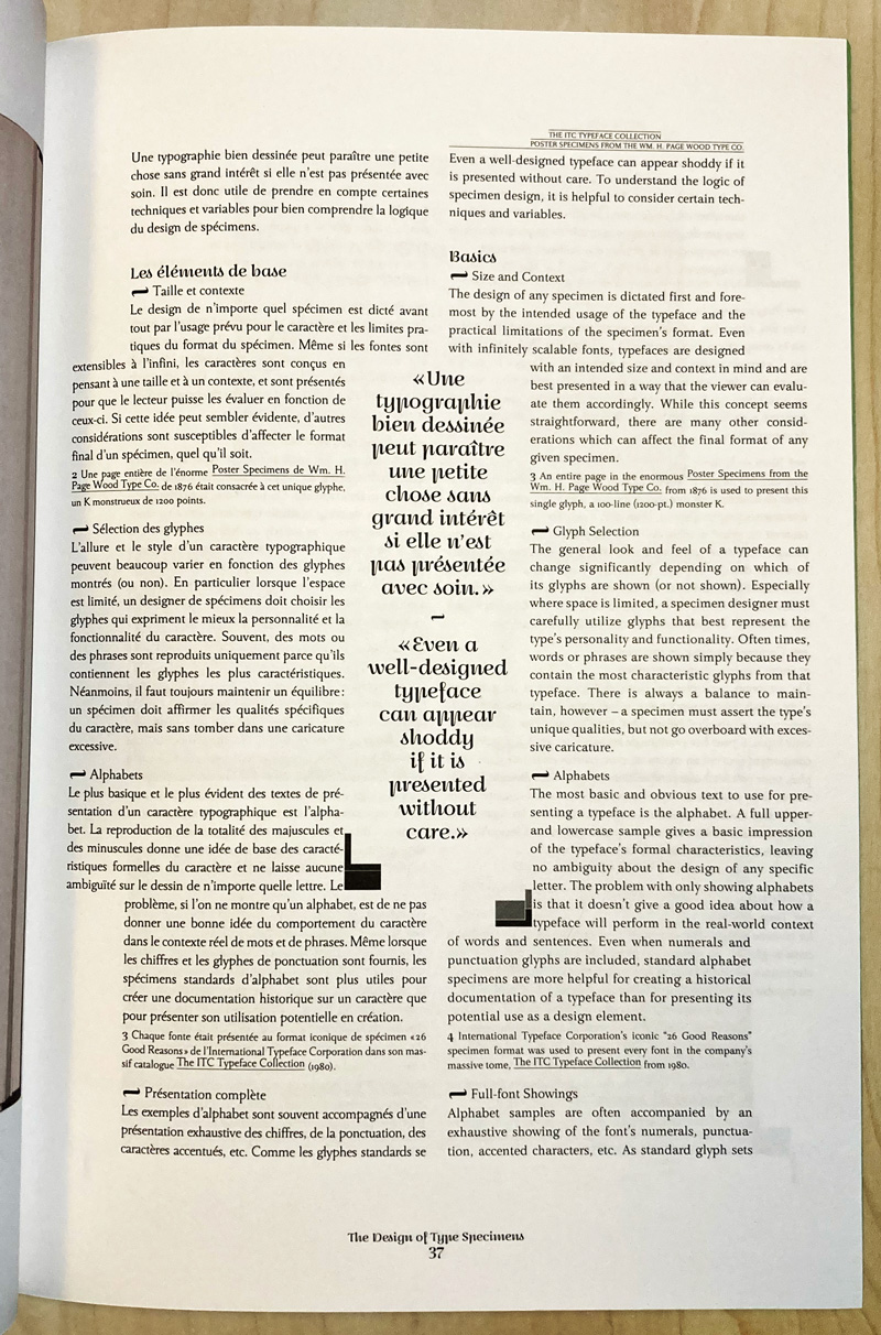
Coming back to one of my early questions, what about a text that’s primarily in one language but includes words, glyphs, or whole sentences in another? That’s not so difficult if the main language is, say, French, and includes quotations in German or Spanish. If the secondary language uses a different script, though, then the question becomes: does the quoted material have to stand out from the surrounding text (as in an archaeological article in English about, say, Egyptian hieroglyphs) or should it blend in (quotations from Greek and Hebrew in a Biblical commentary, for instance). This is where fine adjustments to weight, size, alignment, and even letterspacing may be required.
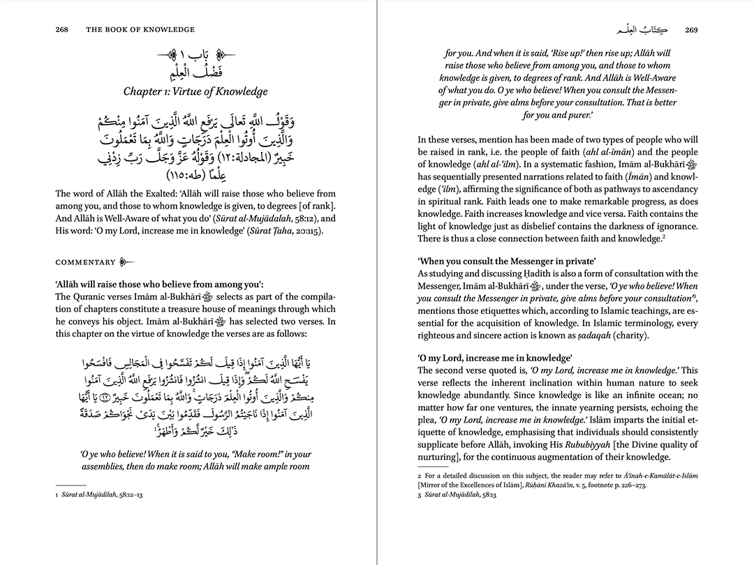
In his recent article about dealing with multiple languages and scripts (Eye 106, the “type special issue”), Ferdinand P. Ulrich put it succinctly:
“In recent years, the topic of multi-script type has preoccupied both type designers and graphic designers. Though designing typefaces for two or more writing systems and designing documents that use multiple scripts are separate disciplines, decisions in each are informed by the other.”
Related Links
Peter von Arx (German only)