Good Will by Design: Acknowledging the type designer’s contribution.
Type designers love to see how their fonts are used.
Some are typographers themselves – visual designers who use type – and may even have created a typeface because they needed it for some specific project they were working on. But typography and type design are two different crafts, not necessarily practiced by the same people.
So when I use someone’s typeface in a book or a magazine or some other piece of graphic design, I like to send a copy to the designer, if they’re among the living. (Hard to send a copy to Claude Garamond or John Baskerville at this point.) Or at least forward a PDF or a sample in some other form. To show them how I’ve put their creations to work.
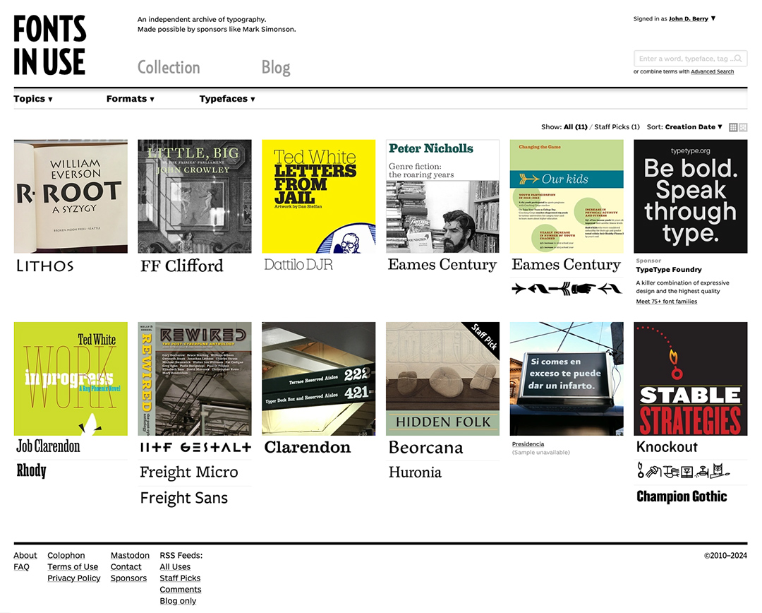
I also keep trying to remember to add examples to the excellent website Fonts in Use, which is an ongoing record of how fonts both new and old get used in practice. Besides offering inspiration to graphic designers, Fonts in Use also serves as a record and an archive.
Since I am at heart a designer of text, it’s text faces, not display faces, that interest me most. Choosing a typeface that fits the style and content of a book, and that will help its readers connect with the words and ideas of its author, is an important aspect of text typography. (Of course, it’s not just the typeface but how it’s used that makes a page or a paragraph readable.) Typefaces that I have used successfully in books or publications, time and again, include MvB Verdigris, Dolly, Minion, Adobe Caslon, Janson Text, and FF Quadraat.
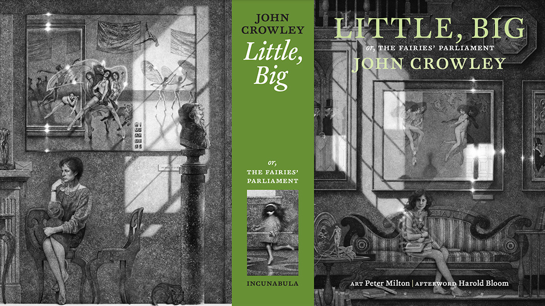
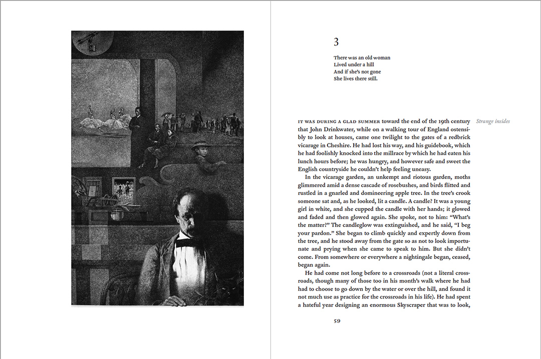
For one of the most ambitious book projects I’ve done, a deluxe edition that started out to be the 25th anniversary edition of John Crowley’s novel Little, Big and ended up being the 40th anniversary edition, I chose a typeface that I thought evoked an appropriate era of book publishing: FF Clifford (FontFont). I used generous type size and leading on the large pages, to give Crowley’s novel and its accompanying artwork a sumptuous yet comfortably readable setting. Petra Weitz of FontShop International donated the use of the OpenType release of Akira Kobayashi’s FF Clifford, and when the book was finally published – long years later – I made sure that we sent a copy to Petra; I sent PDF samples to Akira and offered to have a copy of the full book sent to him, too.
For a less ambitious project, a paperback collection of short stories by author Emily Skaftun for Fairwood Press, I got to use John Hudson’s sturdy and elegant typeface Castoro (Tiro Typeworks), a design inspired by 16th–18th-century Dutch types. Castoro was first developed for the Murty Classical Library of India, with an extensive set of diacritical marks needed for transliterating South Asian languages. (Tiro Typeworks also developed a set of fonts in several Indic scripts for the Murty library; originally a subset of Castoro was included ink each of the Indic fonts.) It’s a workhouse typeface that sets well across a wide variety of texts. And if I’m remembering correctly, this was the first time Castoro had been used on its own for a book, so John was quite delighted to see it.
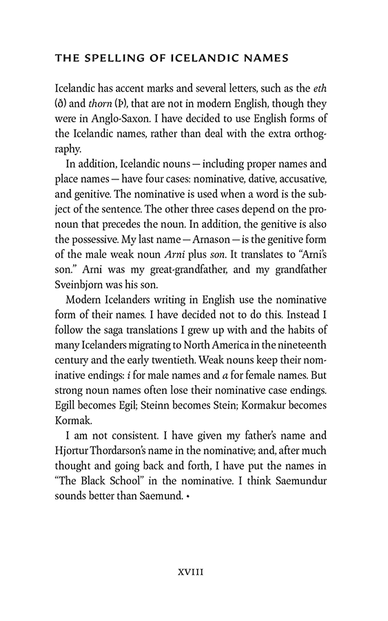
John Hudson’s partner in Tiro Typeworks, Ross Mills, created Huronia to handle another multilingual situation: typesetting both the Latin alphabet and the Inuktitut syllabary used in Nunavut and across the Canadian Arctic. The book I was designing, Hidden Folk: Icelandic Fantasies, by Eleanor Arnason, didn’t require Canadian syllabics, but it did require the Icelandic eth (ð) and thorn (þ) characters. Huronia was described by Ksenya Samarskaya in a review on Typographica as “a pleasure up close and a graceful plodder for setting long copy.” The display face I used for titles and on the jacket was a heavy weight of Carl Crossgrove’s sharply incised Beorcana (Terrestrial Design). I sent samples to both designers.
It’s not always about text.
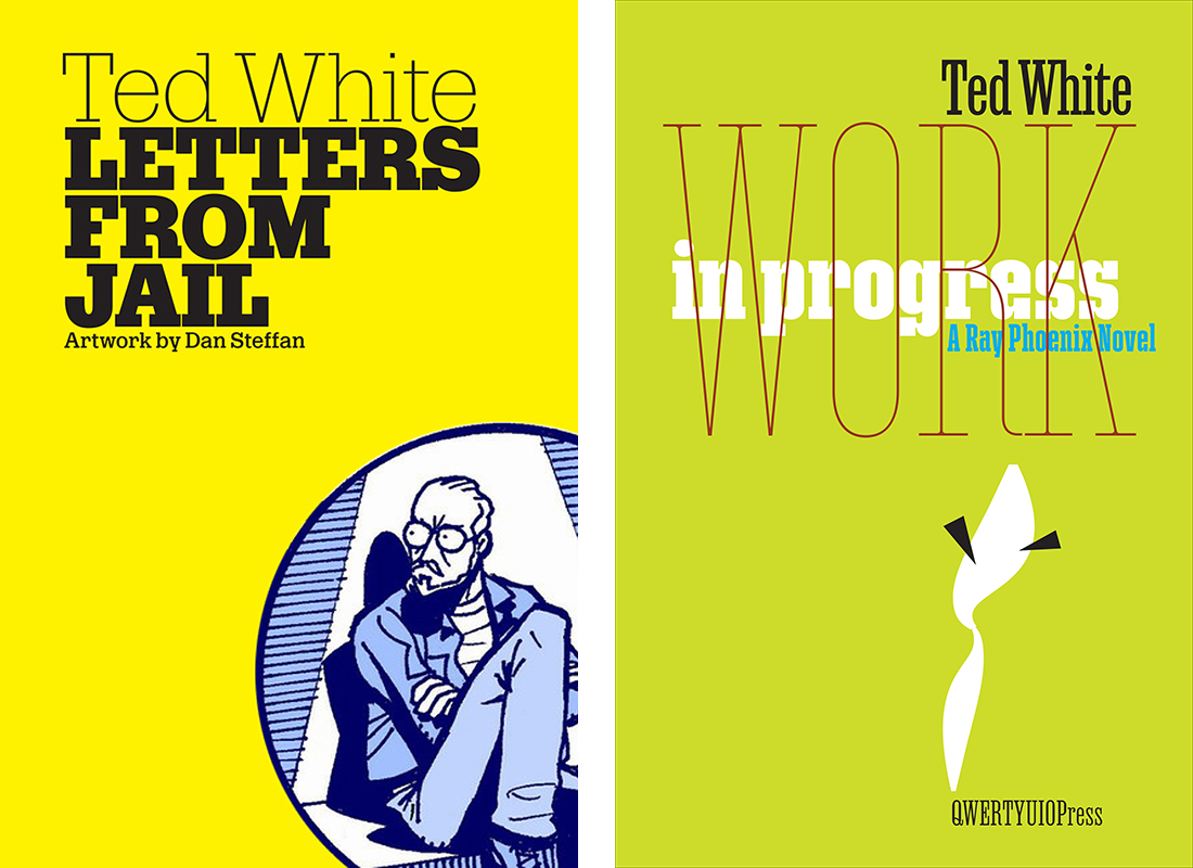
The prolific type designer David Jonathan Ross (DJR) keeps coming out with new experimental designs through his Font of the Month Club, and I love it when one of his new releases fits into a project I’m working on. Two small-press books by the writer Ted White gave me an opportunity to go wild with DJR fonts. For Letters from Jail, I combined a very heavy and a very light weight of Dattilo Banner on a stark yellow cover, with Dattilo Text for the artist’s credit. For a novel called Work in Progress, I was thinking of the classic abstract cover designs of New Directions paperbacks in the 1950s; I chose various weights of Job Clarendon along with one weight of Rhododendron, typeset in an extreme contrast of sizes, widths, and overlap, and a simple abstract smoke-like shape that actually came from Alice Savoie’s Faune (Frenchtype).
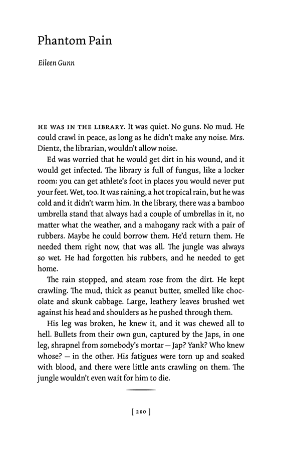
A long-time favorite of mine is Dolly (Underware), which I have used for both of the books of short stories by Eileen Gunn that I designed (for different publishers). It feels friendly and modern (not high-contrast “modern” in the type-history sense) and a good medium for presenting Gunn’s quirky, unpredictable fiction.
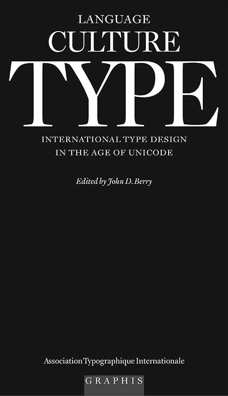
One last item, a book that I edited but didn’t design. For the ATypI/Graphis volume Language Culture Type, book designer Maxim Zhukov used text and display faces designed by Matthew Carter, including a banner version of Vincent for the title on the front of the jacket, set very large in all-caps. The serifs of the ’T’, the ‘Y’, and the ‘P’ had subtle curves that didn’t want to align; for this book, Carter created a special ‘TYP’ ligature just to make the title fit properly. This is one advantage of working with the designer of the fonts you’re using!
Additional Links
- Little, Big 25th Anniversary Edition by John Crowley
- Emily Skaftun
- Stable Strategies and Others by Eileen Gunn
- Questionable Practices by Eileen Gunn
- MvB Verdigris
- Dolly Pro
- Adobe Caslon
- Janson Text
- FF Quadraat
- FF Clifford
- Castoro
- Huronia
- DJR Font of the Month Club
- Dattilo
- Job Clarendon
- Rhododendron