At the 2024 ATypI conference in Brisbane, in April, there were several talks that touched on aspects of Chinese type and typography. One of the most interesting was Eric Q. Liu’s “East in West, Grid is Best,” in which he showed how the grid system popularized by Josef Müller-Brockmann could be adapted to the typesetting and layout of Chinese. After his talk, Eric gave me three small booklets about different aspects of Chinese typography, published as a series by The Type, “an independent Chinese project focusing on typography, design and society,” with a distributed base in London, Shanghai, and Tokyo. The first one, which he authored, is entitled Kǒngquè: restoring the mindset of Chinese typesetting.
You’re probably familiar with the basic idea of the grid system, whether you’ve read Müller-Brockmann’s big red book or not. In essence, it divides up a page into consistently sized and arranged blocks of space, both horizontally and vertically, and uses that structure as the basis of page layout for both image and text. In detail, it bases each grid on the characteristics of the typefaces being used, starting with the size and leading of the text type. It can get quite complicated when the goal is to visually align the tops of the letters of both text and display type, rather than keeping the baselines consistent.
Chinese type, unlike the Latin alphabet, lends itself naturally to a grid system: each character, no matter how simple or complex, is defined within a notional square box. What this means, as Liu points out, is that a line of text must be a certain number of characters long (or high, in vertical setting). Instead of defining the text block on a page but setting the page margins, as InDesign normally does, you’d figure out how wide and tall you want the text block to be, and let that determine what the margins should be. In the Chinese version of InDesign, thanks to Liu’s insights and advocacy, there are two ways of defining the page, and the user can choose one or the other: Western-based, by margins, or Chinese-based, by number of characters in a line.
The default way to set a line of Chinese text is with no extra space between characters – and since there are no separate “word spaces” in Chinese, there is no other variable, no equivalent of the complicated calculations that a layout program uses to set justified text in a Western alphabet. As Liu points out, if you do want to loosen the space between characters, you should do so throughout the entire text, and calculate the line lengths to include that spacing. There is no natural “ragged right” setting; you’d have to force line breaks individually in order to vary the line length. (Which presumably one might do in setting a subtitle or an advertising headline, to make the lines break according to the meaning. But it’s not something you would normally do in text, according to Liu.)

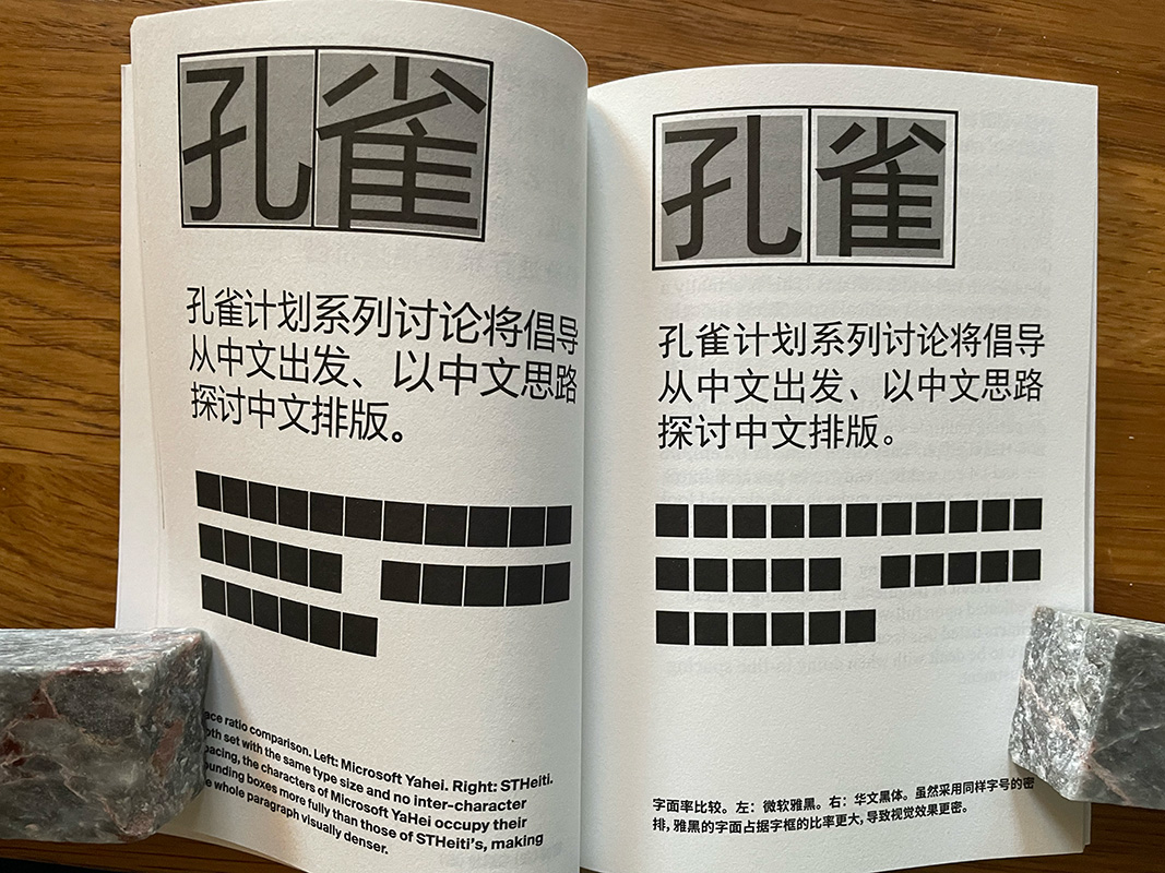
what makes a Chinese typeface look tight or loose is its “face ratio”: how much of its square bounding box is actually taken up with strokes.
When setting type in the Latin alphabet, we pay a lot of attention to the space between letters; the fit of the typeface, whether the default or an adjusted value, is an essential aspect of text typography. One insight that I learned from Liu’s book is that what makes a Chinese typeface look tight or loose is its “face ratio”: how much of its square bounding box is actually taken up with strokes. A typeface that occupies its bounding box more fully will appear denser than another typeface, at the same size and spacing, that balances the interior and exterior spaces of the character differently.
One factor that can throw off even character-by-character spacing is punctuation, which is commonly used in modern Chinese typesetting. There are different forms of punctuation like the equivalents of periods and commas, some centered in their box and others aligned to one edge. The choice may vary depending on whether you’re setting horizontally or vertically – both of which are common in Chinese. The latter part of Liu’s booklet deals with the inevitable exceptions, such as half-width punctuation, and finally addresses pinyin (the Latin-based system of transliterating Mandarin) and mixed settings that include words or phrases in English.
Even though I can neither speak nor read enough Chinese to be useful, I find this detailed critique of typography in another language and writing system fascinating. The Kǒngquè booklet is a condensed exploration of an ongoing project. “This project’s ultimate goal is to inherit and adapt traditional Chinese typesetting practices in the digital age so that Chinese typography can be more elegant in the future.”
Related Links: