What happens when you italicize a font?
The application you’re using tries to apply an italic style to the text you’ve selected.
In a perfect world, the software would change the font from, say, Blomsk Roman to Blomsk Italic, and display the appropriate glyphs from Blomsk Italic. But the world is often less than perfect.
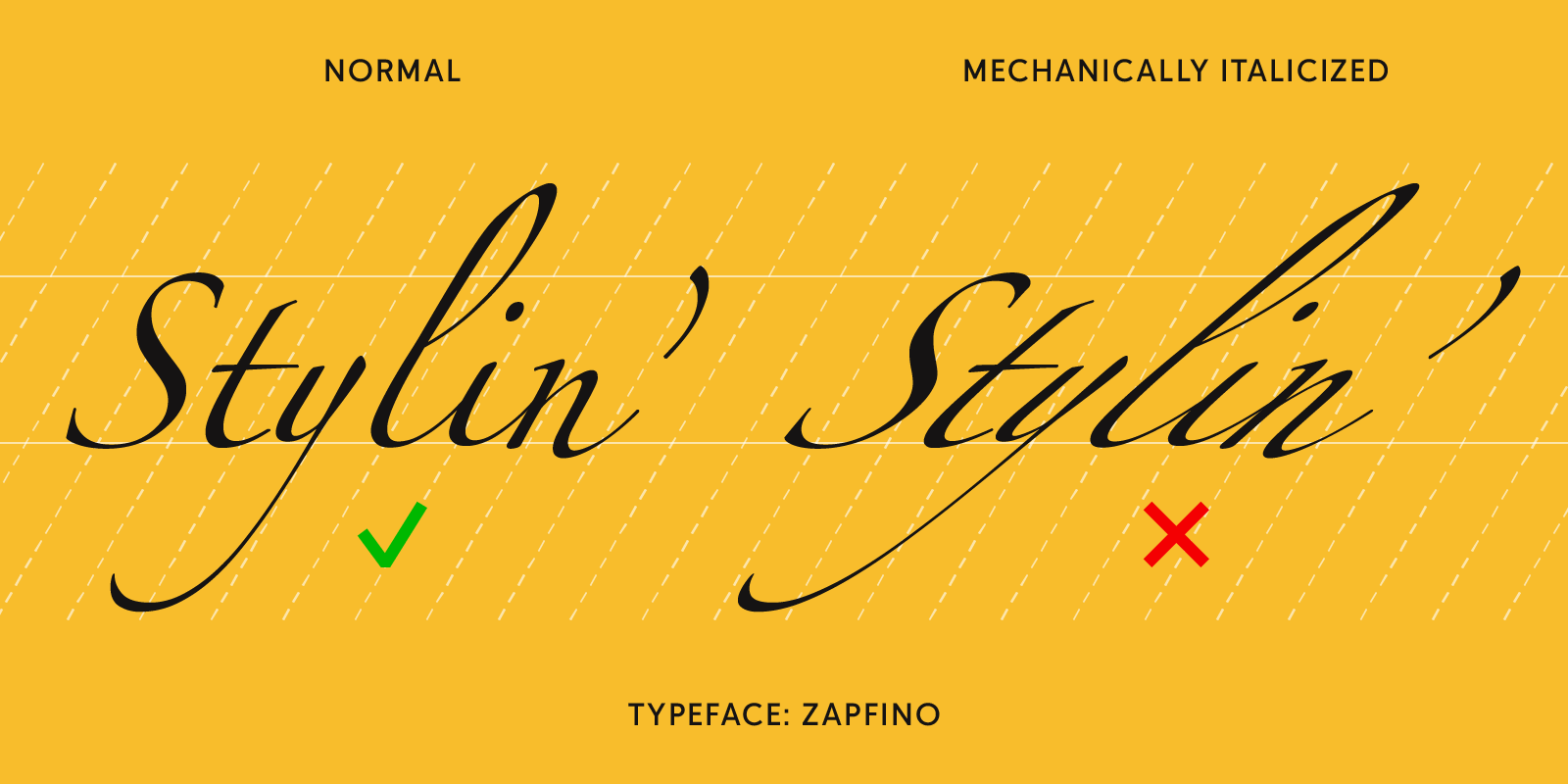
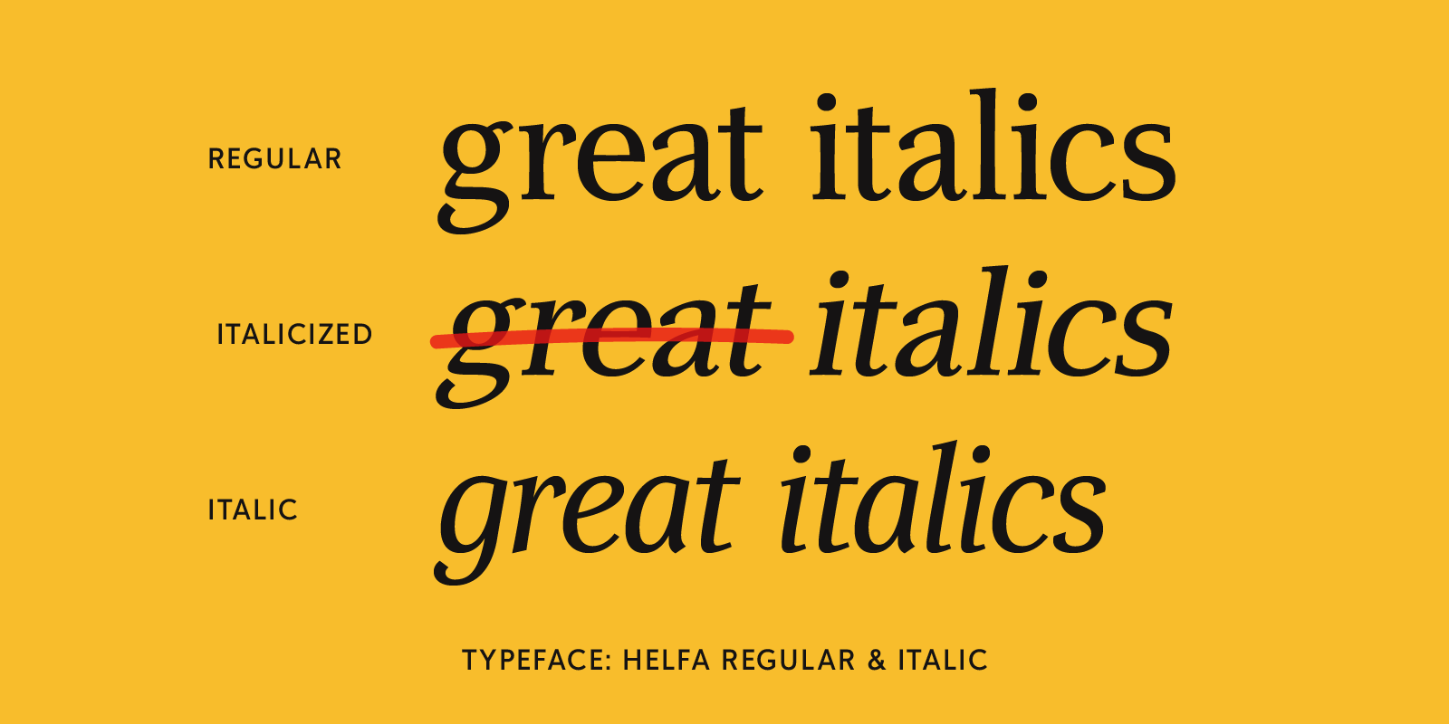
First of all, there has to be a Blomsk Italic font and it has to be installed on your system alongside Blomsk Roman. Not all fonts have an italic complement. Zapfino, for instance, is already a spectacularly swashy calligraphic typeface, and “italicizing” it would make no sense. But some applications will try to italicize anyway, which is how you can end up with an optically slanted version of a roman font instead of a true italic. (Or, if you apply an italic style to an italic font, you might end up seeing the letters super-slanted.) Ideally, the software would simply ignore a request for a nonexistent style, and perhaps pop up a gentle note that the font you’ve asked for isn’t there. But, as I said, it’s an imperfect world.
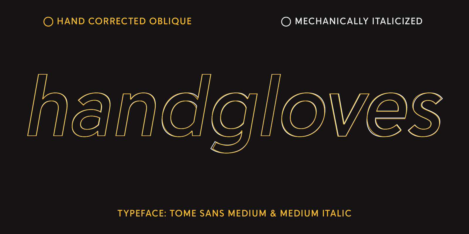
Complicating things for many ordinary users is the fact that some typefaces, especially but not exclusively sans serifs, may have an “italic” that is actually an oblique version of the roman – and spotting the difference between that and an artificially slanted version of the same roman can be hard for non-experts. The important difference is that the oblique glyphs are drawn that way, not simply tilted with a snap of the software’s fingers.
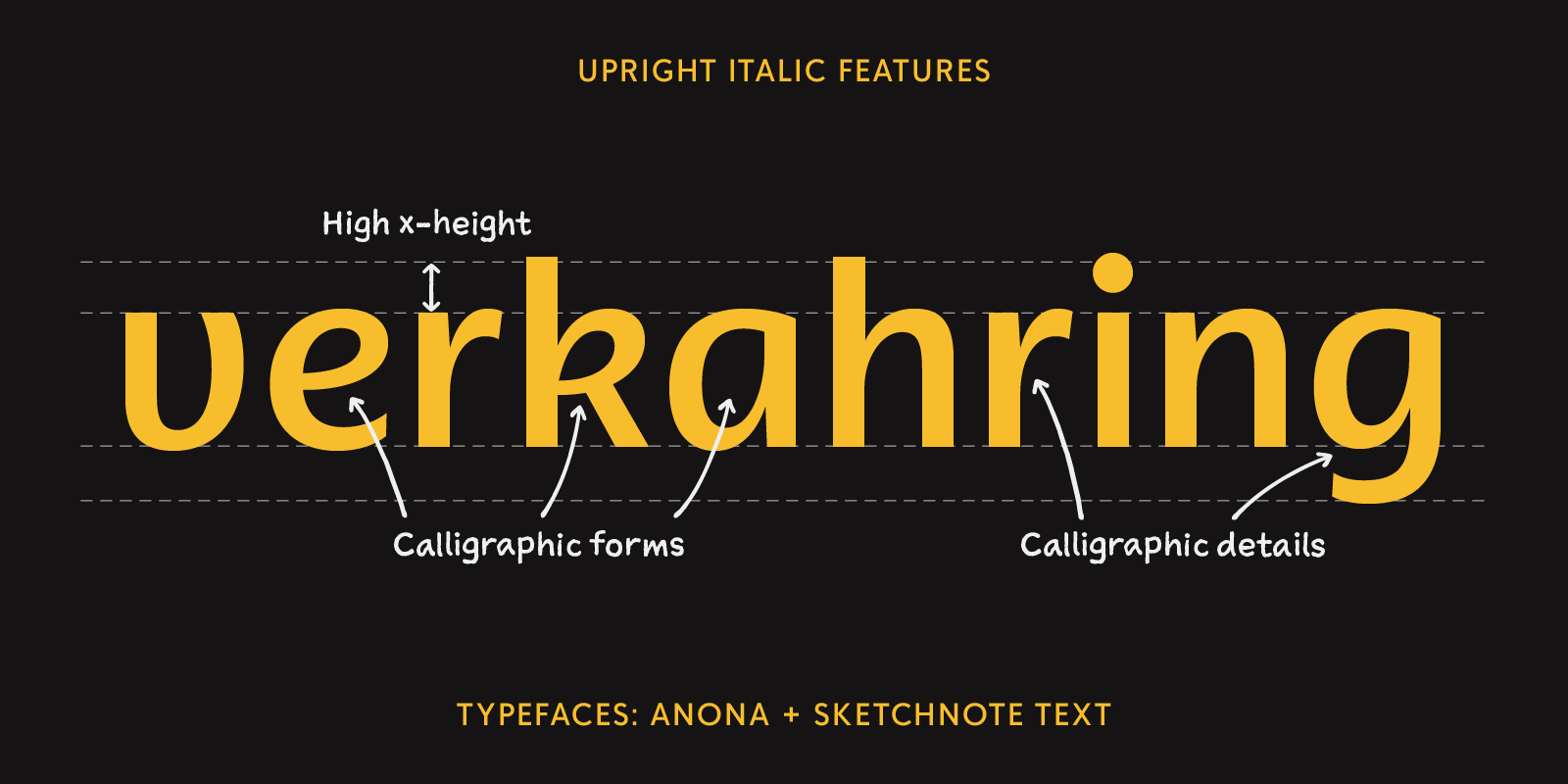
Just to complicate matters more, it’s worth noting that a cursive “italic” style isn’t really about slant, but about the forms of the letters. Joana Correia’s Anona typeface is an example of an “upright italic,” a typeface with an upright stance but letter forms that come from cursive handwriting.
When all type was bits of metal carved by hand, each font was a separate thing. A punchcutter might create an italic style to go with an upright roman, but they’d be two separate fonts. But the advent of photo and then digital typesetting changed this, making it possible to “transform” a single design, much the way you might apply a filter in Photoshop to change how a photograph looks. Designers of digital fonts usually do draw separate versions of their typefaces for each style – but not always. Yet those default style choices remain on the menu: regular, italic, bold, bold italic. And naturally users want to put them to use.
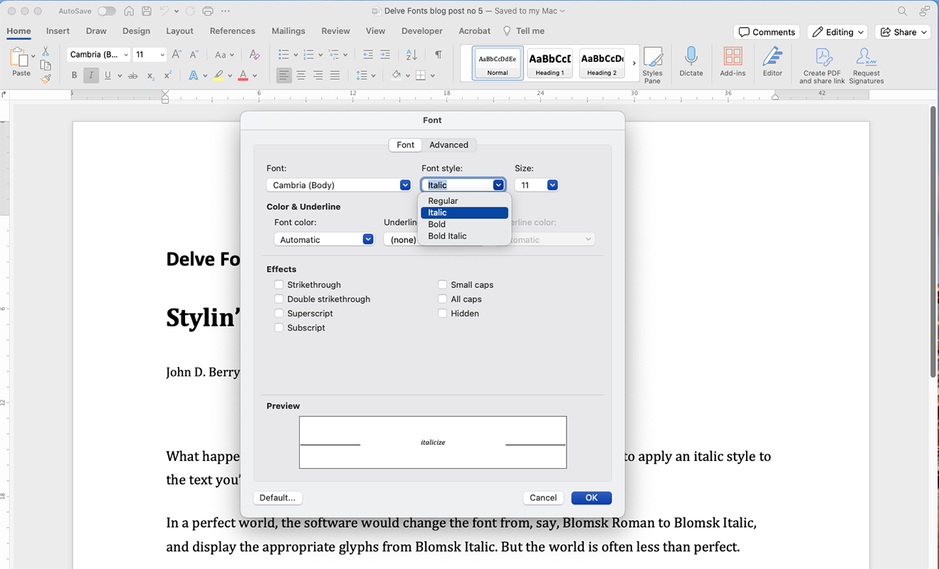
Again, it’s an imperfect world. Software companies really don’t want to make their users unhappy by chiding them for their formatting choices. As Microsoft’s Simon Daniels notes, “The B and I buttons are amongst the most used features in Office. People use them to add emphasis to text. If we were to start throwing errors or gray them out that would hurt customer satisfaction.” It would also generate lots of customer-service calls. “Applying fake styles,” he says, “retaining all the formatting effort the user put into the content is the lesser of two evils.” However, “In the new font picker (web) we flag fake styles using parentheses around the word ‘bold’ or ‘italic’ if the style is fake – a subtle indication, but better than nothing.”
The take-away from all this: don’t assume that all the fonts in your Fonts menu are singing in four-part harmony. It’s best to check to see what fonts are actually installed before you start styling.
Related Links: