What does “weight” mean in the design of a typeface?
As I mentioned in an earlier post, the Fonts menus of many of our software tools tend to offer us a predetermined choice of regular, italic, bold, and bold italic – whether the typeface in question actually has those four variations or not.
It’s not uncommon for a type family to have a range of weights, sometimes running from an ultra-light (with extremely thin strokes) to an ultra-bold (where the strokes, or most of them, are quite fat and thick). This obviously gives us a much wider choice than just “regular” or “bold.”

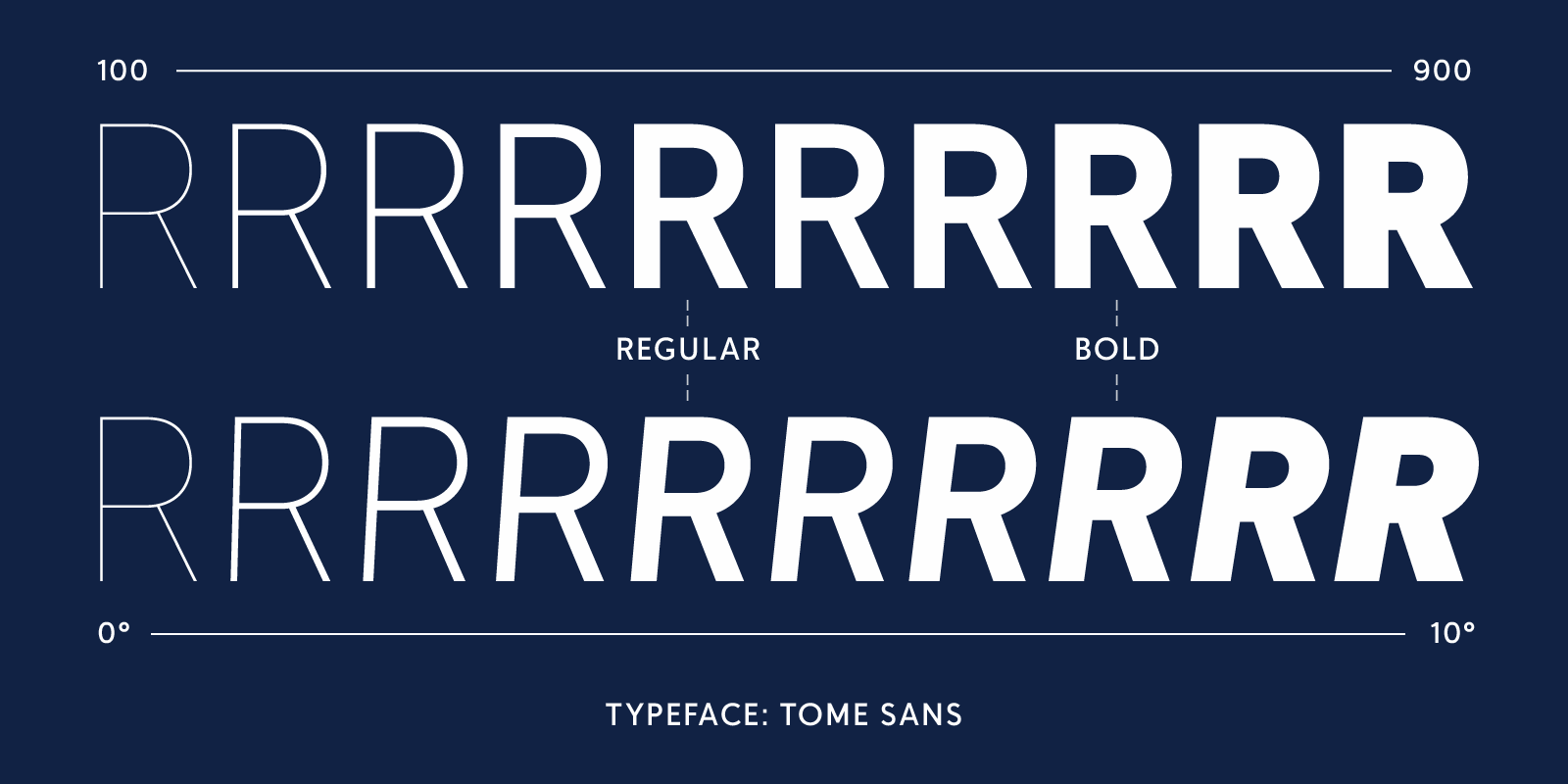
In many contemporary type families, the designer intends the lightest and heaviest weights for display use (that is, at large sizes, in headlines or titles) and the in-between weights – perhaps several of them, finely calibrated – for extended reading in text. Delve Fonts’ Tome Sans family is a good example: a readable sans serif with ten weights, plus an italic for each weight. It also comes as a variable font, where you can use a slider to choose any weight from 100 to 900 (using the units defined in CSS style sheets). Tome’s variable font even has a “slant” axis, where you can choose just how much you want its letters to slant – a handy example of the oblique approach to “italics” that I’ve mentioned before.

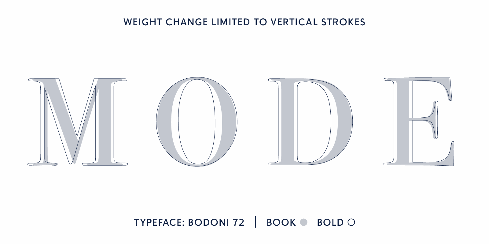
There’s quite a bit of variation in how a font’s letter forms vary as the weight increases. In a serif typeface with high contrast between the thick and thin strokes, such as Bodoni, the thin strokes usually stay the same in bolder weights, while the thick strokes get thicker and thicker. So the contrast between thick and thin is even greater in a bold weight than in a lighter weight of a typeface like this.
In a typeface with fairly even stroke thicknesses, it may be that the whole letter thickens as it gets bolder: but this has practical limitations, if the strokes get so thick that the counters in letters like ‘e’ start to fill in. A well-designed typeface with multiple weights will often have a lot of tiny, careful adjustments to make the boldness seem natural.

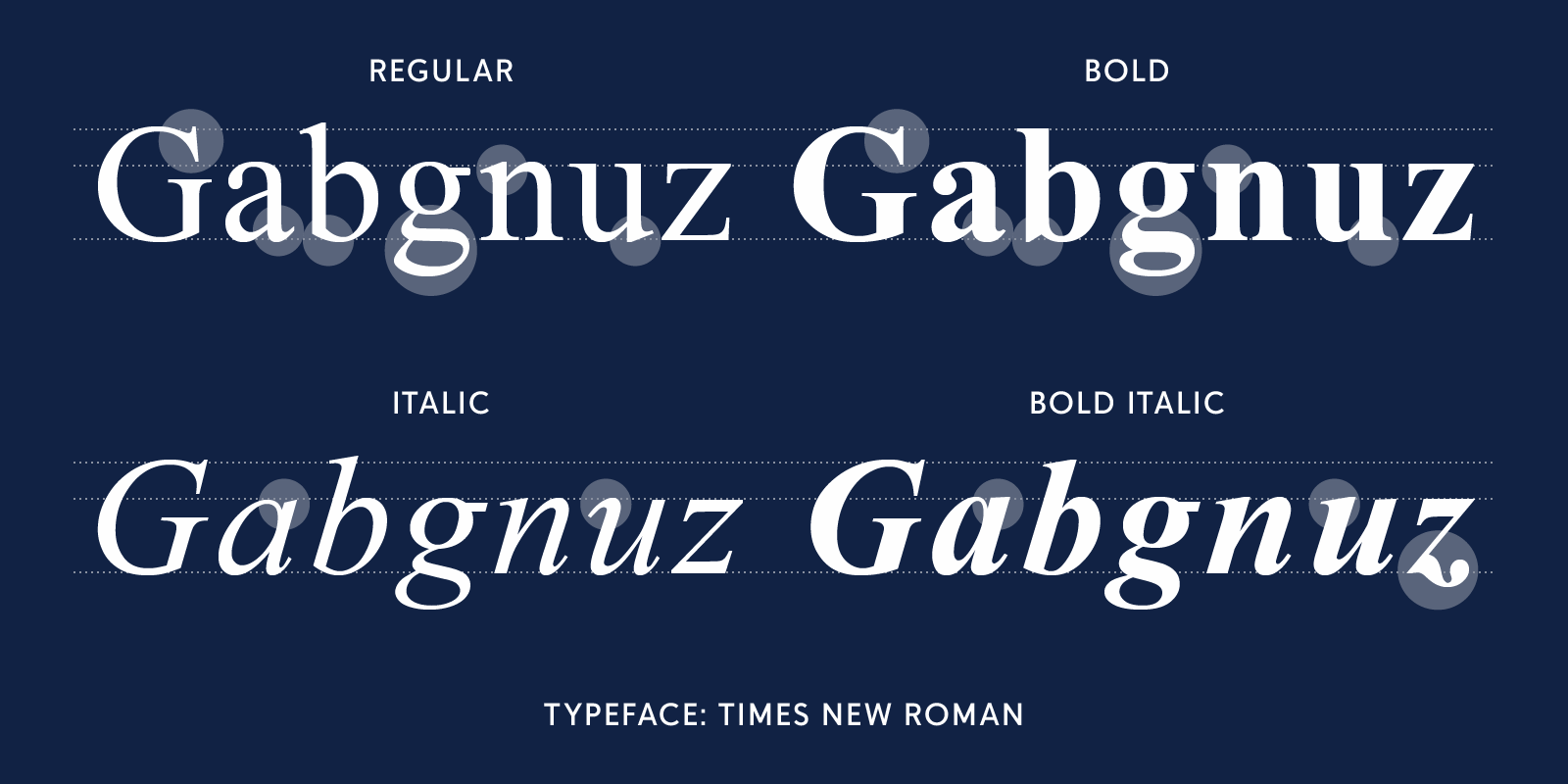
And the change from lighter to bolder weights may not be a smooth progression. Times Bold, for instance, is quite different from Times New Roman, when you look closely at the letter forms. It’s a different design, not just a thickening of strokes. Which is one reason why Times Bold works fine as a display face but can look awkward in text. (And Times Bold Italic is not a cursive variation of Times Bold but a thickened version of Times Italic.)
But what if you’re using a weight called Light and you apply the Bold style to it?
In a digital font family, what happens when you apply a Bold style to an existing lighter weight? If the family has only two weights, regular and bold, then applying a Bold style to the regular weight should give you the properly designed bold weight. But what if you’re using a weight called Light and you apply the Bold style to it? Will it jump to Bold, or will it make a less extreme leap, to Medium perhaps or Semibold? That depends on how the fonts are programmed, but a common technique for a multi-weight family is to jump two steps forward in weight from wherever you start. The only way to be absolutely sure you’re getting the weights you want, though, is to choose each one separately from the Fonts menu.
If you’re dealing with HTML and CSS, the font-weight 400 is considered regular, and 700 is considered bold. But that’s just a default; if more finely distinguished weights exist in the font, you can specify them by number. But if you specify relative weights (“lighter”/“bolder”), CSS only considers four font weights: thin (100), normal (400), bold (700), and heavy (900).
Contrast of weight can be an excellent way of making the hierarchy of different typographic elements clear. Just as with making the font size larger or smaller, though, it’s important to make the contrast strong enough to be obvious.