Maxular®
A rounded Slab Serif design
with a special origin.
Designed by Steven Skaggs
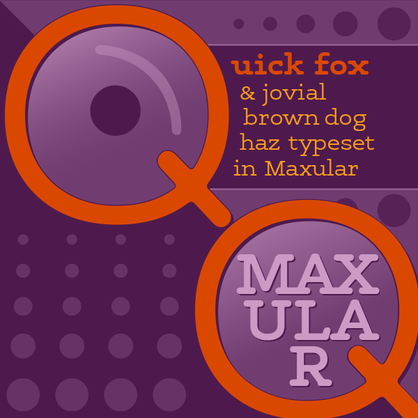
Maxular
Nonzero Pixels
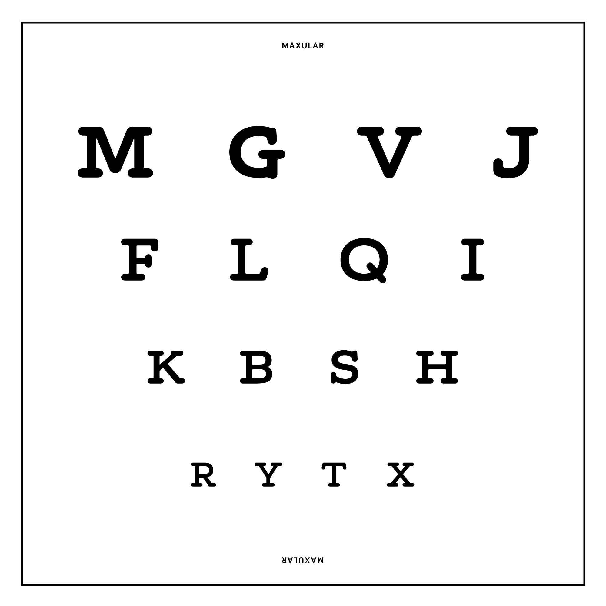
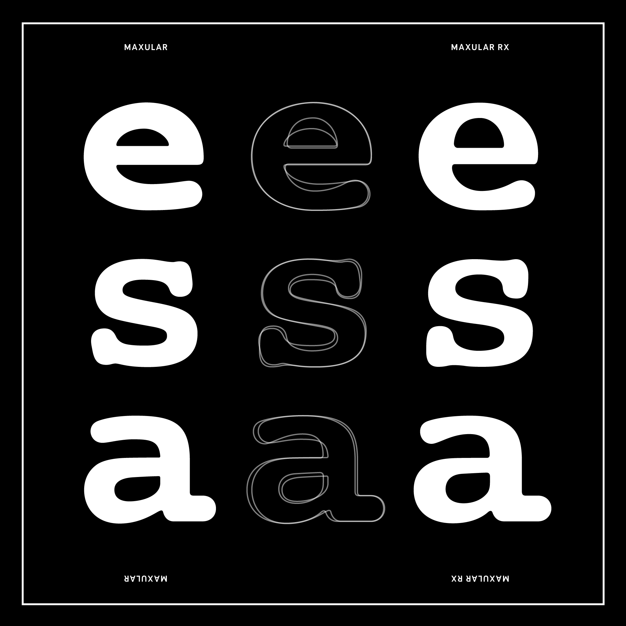
Maxular Rx
Optical Coherence
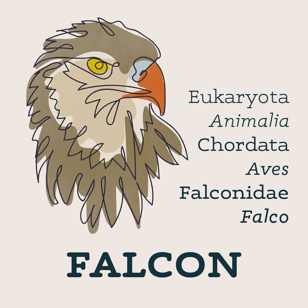
As of 2020, Macular Degeneration affects more than 190 million people globally. In 2013 it was the fourth most common cause of blindness after cataracts, preterm birth, and glaucoma.
Incluso si las drusas pueden estar implicadas en la pérdida de la función visual, debe haber al menos otro factor que explica la pérdida de la visión porque la recepción normal de la retina y la transmisión de imágenes a veces son posibles en una retina cuando hay altas concentraciones de drusas.
Gallery
Story
Six years in the making, Maxular and Maxular Rx are two new, rounded slab serif typefaces by award winning designer, author, and educator Steven Skaggs. Maxular Rx is the first typeface expressly designed — and proven in scientific tests 1 — to address the visual distortions caused by Macular Degeneration (MD), which afflicts over six million people globally. From the beginning, the design of Maxular Rx was informed by the advice of a consultant who has moderate MD. Its development was also shaped by months of testing through two independent clinical trials with dozens of MD subjects and normal sighted subjects participating in the scientific tests.
Special features of the Rx versions
Unlike most general low-vision fonts, which are sans-serif, Maxular Rx is a serifed font. Studies have shown that under the particular distortions of macular degeneration, serifs aid in separating one letter from another while reinforcing the reading line. The terminals of all strokes and serifs are rounded to avoid angular distortion effects. Likewise, all of the junctions in the typeface have been rounded to inhibit distortion flares. One outcome of the tests was the decision to retain familiar letter forms, as more conventional alphabetical forms tested consistently superior to unconventional shapes. As a result, Maxular Rx uses conventional forms to keep the reading speed and comfort level high, even at very small sizes.
The letter forms are extended in order to project clearly to peripheral vision. A very large x-height helps the font body appear larger to the eye. Inter-letter and word spacing is more open to assure the glyphs are distinctly discriminated. Greater line spacing is built-in, to prevent overcrowding in the vertical dimension even in apps and on devices that do not allow for increased line space.
The other Maxular fonts
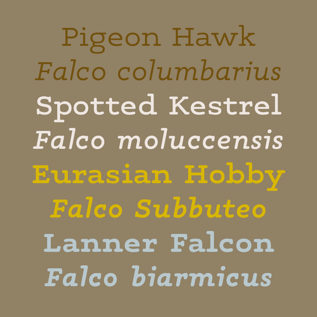
Of course, we didn’t stop at just the two Maxular Rx versions. Understanding that some of the special features Rx employs could be distracting for normal-sighted readers, Skaggs re-drew many glyphs and drew new italics for the six Maxular (non-Rx) versions, intended for everyday use.
Going further afield
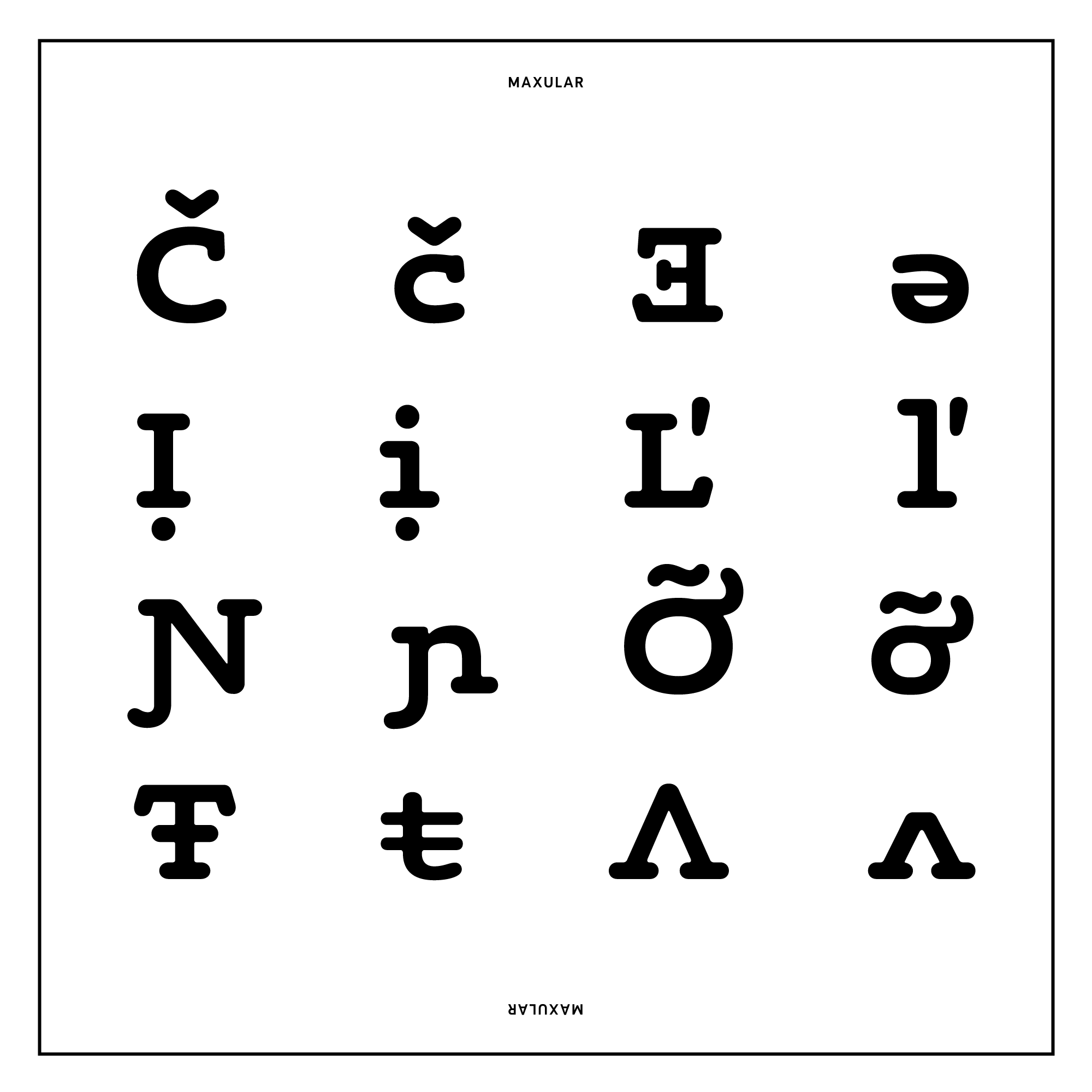
Every font in the Maxular family has a character set of over 700 glyphs, with support for 305 languages including Czech, Polish, Turkish, and Vietnamese. It also features a useful set of eight arrows in each font and a handful of fun alternate glyphs in the italics.
1 Fonts Designed for Macular Degeneration: Impact on Reading , 2018, Ying-Zi Xiong, Ethan A. Lorsung, John Stephen Mansfield, Charles Bigelow, and Gordon E. Legge. •!•
Features
Additional features include: Kerning, Standard Ligatures, Discretionary Ligatures, Ordinals, Case-Sensitive Forms, Fractions, Numerators, Denominators, Superscript, Subscript, Tabular Figures, and Localized Forms.
Glyphs
Basic Latin 94
Latin-1 Supplement 94
Latin Extended-A 127
Latin Extended-B 52
IPA Extensions 3
Spacing Modifier Letters 9
Combining Diacritical Marks 25
Greek and Coptic 4
Latin Extended Additional 137
General Punctuation 16
Currency Symbols 2
Letterlike Symbols 1
Arrows 8
Mathematical Operators 12
Geometric Shapes 1
Alphabetic Presentation Forms 2
Latin Extended-D 3
Additional Glyphs 8
Maxular supports 305 languages. View our language support page to see which.